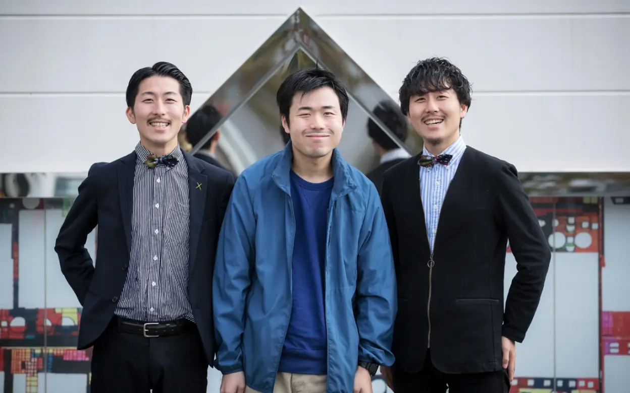
Brand Story
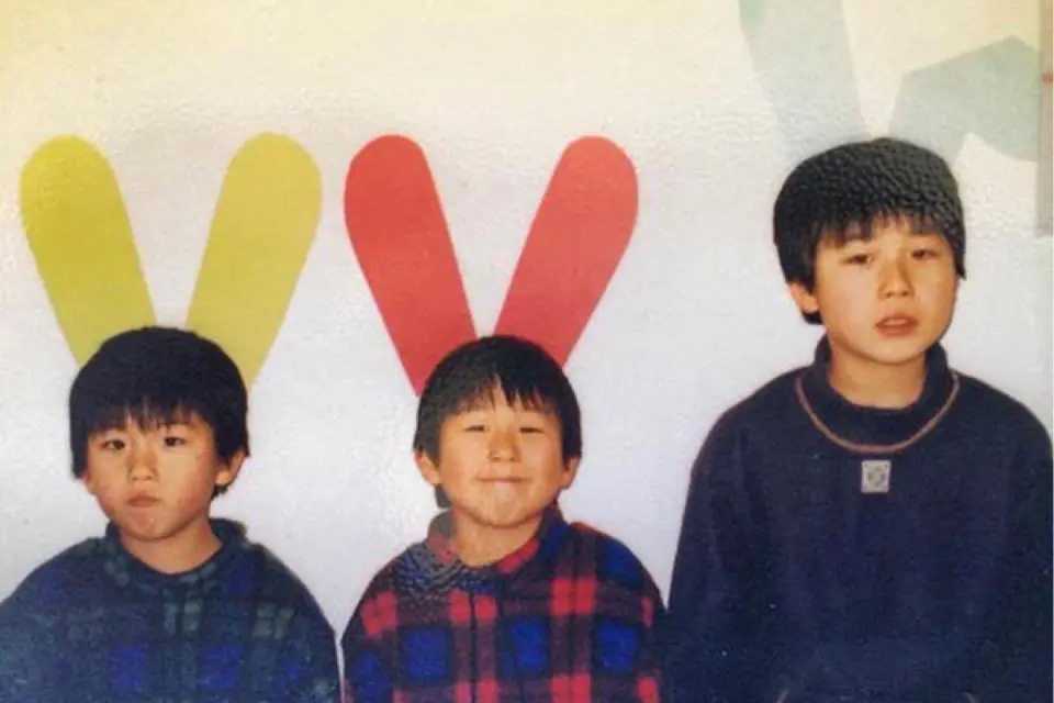
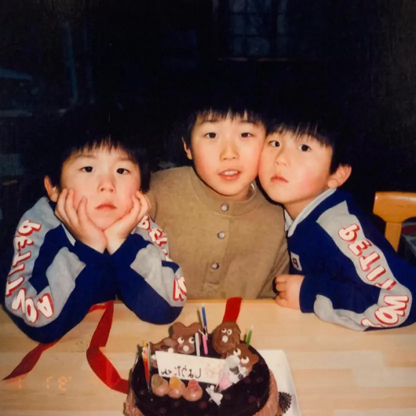
HERALBONY all started with
our beloved brother,
who is 4 years older than us.
He was born with ASD, which is
a type of congenital anomaly.
But he laughs like us, hurts like us,
shows anger like us, and cries like us.
He feels these emotions, and goes
through his everyday life in peace,
just like any other “normal” person would.
But we grew up listening to people
“feel sorry” for our brother.
Why? We would often ask. Why should anyone
“feel sorry” for someone who is capable of feeling emotions like us?
Surely one’s personal emotions cannot be
better than that of another?
We grew up wondering why, until quite naturally
we decided we wanted to go into business
that involved people with intellectual difficulties.
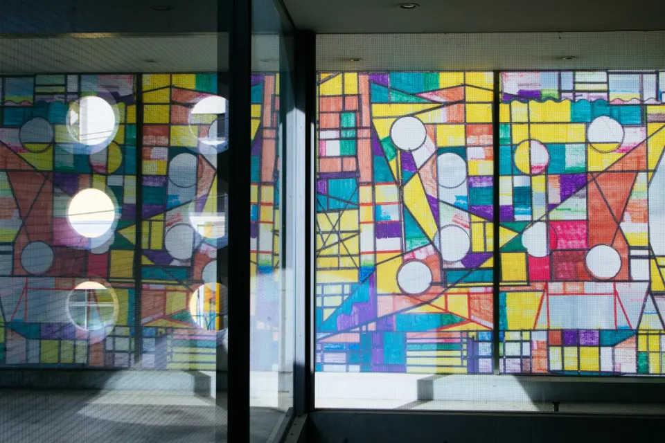
HERALBONY believes that by accepting disabilities as individual uniqueness,
we can introduce a completely new perspective to the world and help others see things in a different light.
There is a world of splendors that can only be captured through the eyes of
our unique, colorful artists.
Instead of pushing them to adapt to society,
maybe society can adapt to
embrace the uniqueness in others.
HERALBONY is a social impact startup that aims to
“radiate the colors”
of our artists in the hope to one day achieve such society.
Brand Name
a random word by our ASD borther "Heralbony"
“HERALBONY” was a random word our autistic brother Shota wrote down
in his notebook when he was seven.
That’s why it probably sounds unfamiliar. You can search the internet and
find that there is no such word.
HERALBONY
The word may not mean anything to anyone out there in the world.
But to our brother, at seven, the word must have sounded like a whole new world.
Maybe he liked how it tickled his senses,
maybe he liked how the word looked when written down.
He liked it, he saw meaning in it, so he wrote it.
We named our company HERALBONY in the hope to capture and create new values
in the small things that may, at first, seem worthless.

Our attitude of utmost respect for the artist
has remained unchanged since the foundation
HERALBONY never creates products without the permission of the artist.
This is because we value the idea of
"artist first".
In order to create a sustainable brand, we continue to search for
a process that respects the "genius" of each artist, in addition to giving
back to the artists and welfare facilities in an appropriate manner.

New Logotype
In 2024, HERALBONY redesigned its logo.
The new logo will change from katakana (Japanese character) to English.
It is based on our desire to deliver and extend the value of our ideas and artists not only within Japan but also to the world.
The logo was designed by the Good Design Company, a leading design agency in Japan.
They described HERALBONY as a brand that has a fascination with each of its artists and a clear purpose. They described the company itself as a "contemporary art".
"The logo needs to be stately and authentic."
"The brand has an artistic context, so a traditional serif style would be appropriate."
After many discussions, the HERALBONY logo was reborn.
Symbol Mark
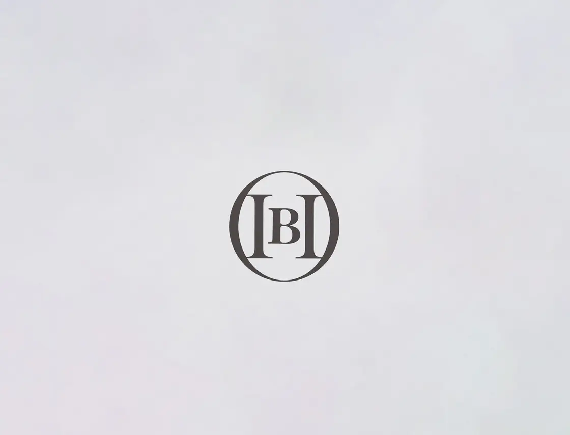
In order to achieve the society that HERALBONY aims for,
we thought that we need a symbol mark that can be used in a variety of everyday situations.
It should be a sophisticated mark that is easily visible in any location and at any size, yet not a mere symbol, but a thoughtful and sophisticated mark.
That is the mark with "H" and "B" in the center, surrounded by "O".
O=OPEN, ORIGINAL, OVERTUNE, and also means "circle".
It will surely become a symbol for HERALBONY's next step.
For a more detailed discussion of the logo and symbol review process, please read the article "To be a cultural company that lasts for 100 years. Creative Director Manabu Mizuno, Heralbony founders Takaya and Fumito Matsuda talk about the background of the new logo.".